
Chart Decoder Series: MACD – The Momentum Signal to Spot Early Entries
Welcome back to the Chart Decoder Series, your step-by-step guide to mastering technical indicators and chart patterns like a pro.
In the previous post, we covered SMA and EMA, two essential tools for understanding trend direction. Now, let’s talk about momentum. Specifically, how to spot momentum shifts before they show up in price.
Enter: MACD (Moving Average Convergence Divergence).
What is MACD?
MACD stands for Moving Average Convergence Divergence. In simpler words, MACD is a momentum indicator. It shows whether the market is gaining steam in a direction or losing strength. In other words: “Is the market about to make a move?”
While moving averages help you see where the market is going, MACD tells you how strong that move is. It’s one of the fastest ways to spot early signs of trend shifts, before the price fully reacts.

It’s made up of three parts:
1. MACD Line (Blue)
Think of this as your momentum tracker.
It reacts when prices start changing direction showing if the market is gaining energy or slowing down.
2. Signal Line (Orange)
This line follows the MACD Line closely.
- When the blue line crosses above the orange one, it often means momentum is turning upward (buy signal)
- When the blue line crosses below, it can mean momentum is turning down (sell signal)
3. Histogram Bars (Red or Green Bars)
These bars show the distance between the blue and orange lines.
Here’s how to read them:
- Bars growing = momentum is getting stronger
- Bars shrinking = momentum is slowing down
- Green bars = bullish energy (buyers are active)
- Red bars = bearish pressure (sellers are active)
Why Use MACD?
MACD is great for identifying potential entry and exit points. It tells you:
- When momentum is picking up
- When a trend may be reversing
- When to sit tight and wait
Example in Action:

MACD Indicator (Bottom Panel)
- MACD Line (Blue): 326
- Signal Line (Orange): –279
- MACD Line just crossed above the Signal Line: bullish crossover
- Histogram Bars turned green and are growing: momentum is building
- This crossover happened below the zero line: early signs of trend reversal
Moving Averages (Main Chart)
- 20-day EMA (Blue Line): ~84,067
- 50-day MA (Green Line): ~84,170
- Current BTC Price: 87,269. BTC price is above both averages, buyers are in control, trend likely continues up.
Pro Tips:
Combine MACD with EMA or SMA for stronger confirmation
Use MACD crossovers near key support/resistance for higher accuracy
Avoid relying solely on MACD in sideways markets—it may give false signals
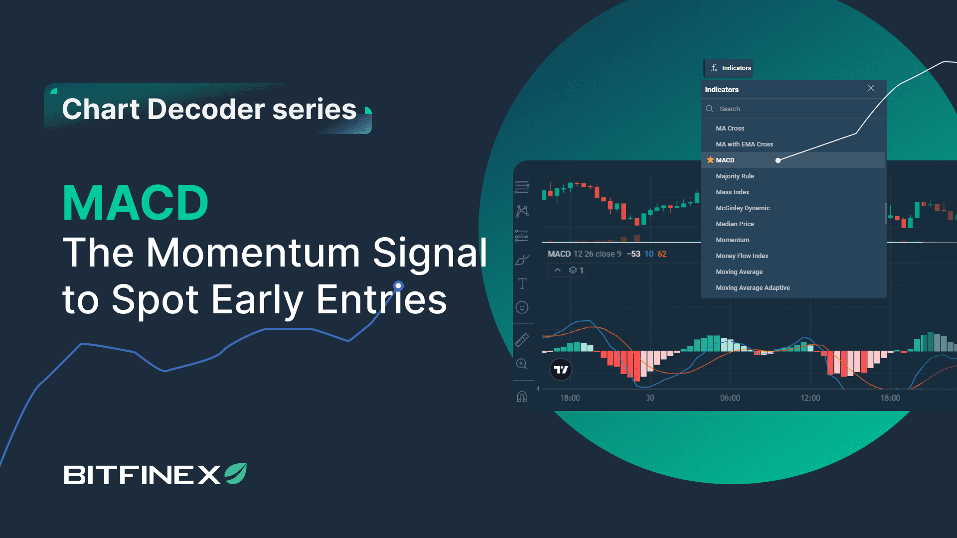
Try It Now on Bitfinex:
- Log in to Bitfinex
- Select any trading pair (e.g. BTC/USD)
- From the Indicators tab, add “MACD”
Watch for:
Bullish Signal: MACD Line crosses above Signal Line
Bearish Signal: MACD Line crosses below Signal Line
Histogram Bars Growing: Trend is gaining momentum
Histogram Bars Shrinking: Trend is slowing down
This practice builds your intuition over time, so you can act with confidence, not confusion.
MACD is a favorite among traders for a reason: it offers early insights into shifts in momentum before they’re obvious in price action.
MACD vs SMA/EMA: What’s the actual difference?